Innovative problem solving provides a great solution, combining two adjacent buildings into a single cohesive practice.
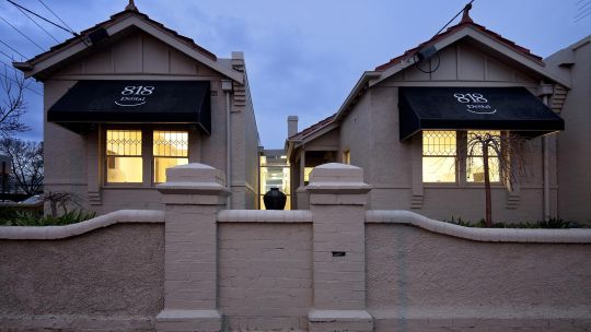
Dr Lloyd Saville approached Medifit with an existing dental practice located at 818 High Street Armadale, Victoria. Dr Saville had purchased the mirror image property adjacent to 818 High Street with the intention to increase the practice with minimum impact to the appearance from the street front. The ‘pigeon pair’ required an innovative and stylish design to merge the two buildings to become one.
After initial consultations with the directors of Medifit the next stage was to discuss the exact design requirements with their appointed Medifit designer to create a tailored design brief to make their dreams a reality. The property at 818 High Street had already been trading as a dental practice for about 6 years and the building had a heritage overlay.
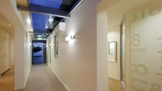
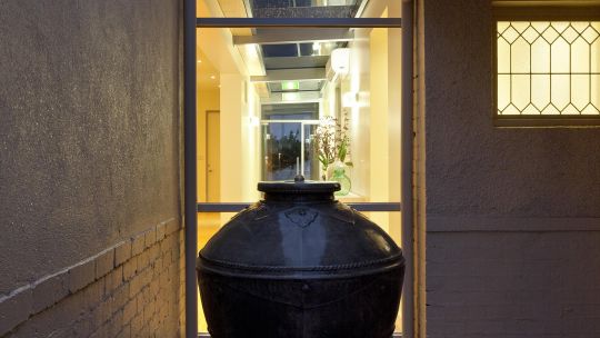
The property at 816 High Street was zoned residential. Medifit decided that the most effective way of merging the two buildings was to retain each title independent of each other via the creation of an unimposing glass atrium structure merging the two buildings.
This lateral thought process also managed to maintain the maximum value of the two properties in one of Melbourne’s more affluent areas.
Council found this approach as a great resolution in that it managed to keep the heritage overlay of the two properties with a minimum impact.
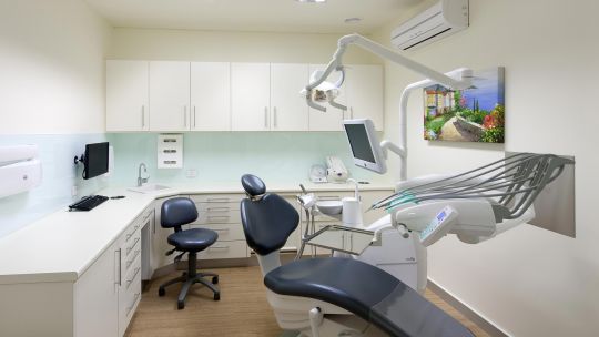
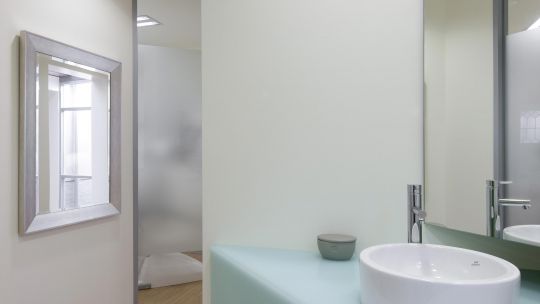
The general design philosophy for the interior was to retain the modern, boutique feel which currently serviced the middle to middle upper class people in this affluent suburb. Dr Savillle required 4 surgeries, 2 hygienists, steri, OPG, practice managers office, staff room, reception and waiting area. Toilets were already located within the building complex, just outside the tenancy making it easy for staff and clients to access.
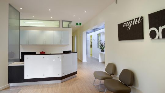
The overall finishes and colour palette were already chosen in the current practice which was previously selected by Lloyd's wife Anne. The contrasting mix of whites, wenge, light timber and a subtle green tinge to the colour back glass were prevalent throughout the interior.
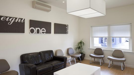
The reception area is simple but sleek. The counter is finished in the wenge laminate with contrasting sheets of white colour back glass pin fixed to create some alternate levels and relief to the face surface. The cupboards behind have been finished in ‘Akril Green Colour Mist’ to achieve the look of glass but in a more cost effective manner. A new spacious waiting room sits adjacent to the reception area with comfortable earthy coloured chairs and a large box pendant centred above a stark white custom built coffee table. A kids play station area with some ottoman seating has been included to cater for the smaller patients.
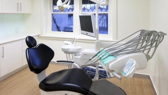
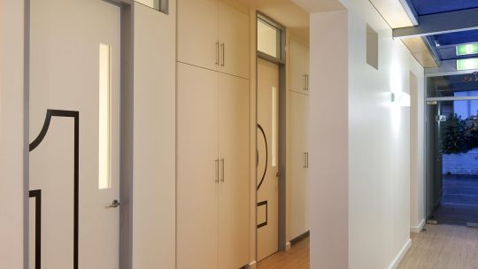
The surgeries are located off the atrium along the external walls of each building providing as much natural light as is possible.
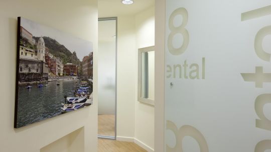
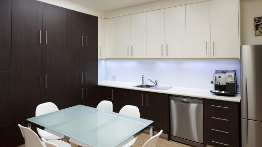
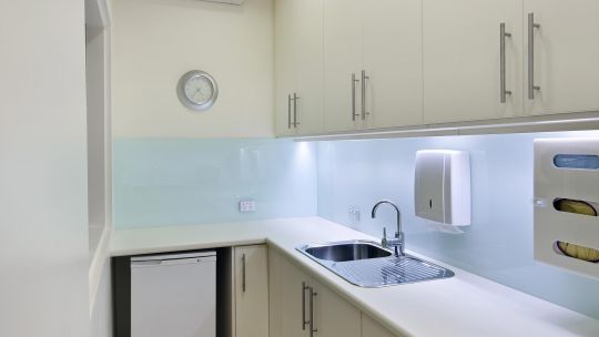
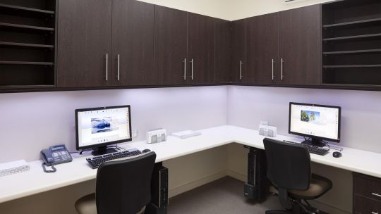
Where an external window was not available we have included glazing to the corridor so that the Atrium can provide the light to those rooms. A spacious staff area is located to the rear of the tenancy and includes a kitchen, table and chairs and staff lockers.
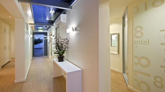
The new atrium walkway was developed after researching different styles and designing something that would be minimal from the street front but provide maximum design impact from the interior. The use of exposed beams, clear finished ply, and glass complement the overall design of the atrium roof which allows maximum interaction to the weather outside.
Click here for a 2022 update on this project
