AWARD WINNER: 2018/19 ASOFIA Best Professional Suite Design
In 2009, Dr Naomi Hollander built her first practice from the ground up in Pakenham. Utilising the services of Medifit, both the building and Naomi's practice (within it) was a success on every level from day one.
Architecturally, the building was a standout in the streetscape. It was designed to accommodate several tenants in addition to the primary dental practice, providing ongoing income and security for Dr Hollander. The building was fully tenanted soon after opening, providing state of the art facilities for a growing dental practice and several other health related businesses.
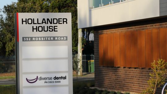
In 2017, Dr Hollander seized the opportunity to repeat her success and secured a block of land in Koo Wee Rup, a regional town on the peripheral of the Melbourne metropolitan premises. The new practice would again be in a purpose-built building owned by Dr Hollander with additional tenancies available for approved healthcare businesses.
After her experience with Medifit at Pakenham, Naomi again sought out Sam Koranis, Medifit's Managing Director to help undertake her new project and Diverse Dental was born.
"Naomi's passion and her drive to succeed are very impressive. We were honoured to be chosen again to help her design and build her second practice and, we are very proud of the outcome."
Following a comprehensive briefing process, Medifit's architectural team swung into action and developed conceptual elevations. The building was designed over two levels, with the dental practice occupying 40% of the top floor, while the balance of the 600 mw lettable area on the first floor & the ground floor would be available for future tenants.
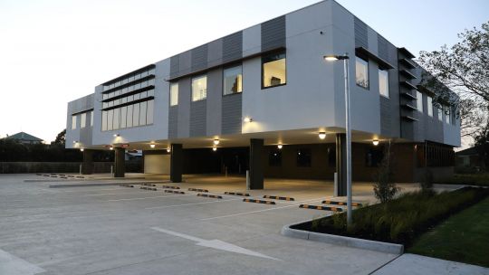
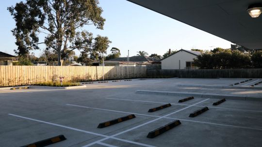
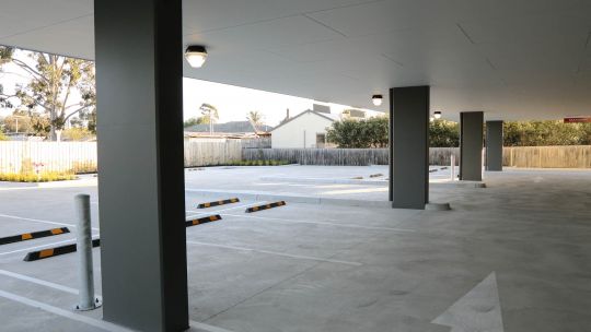
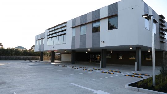
The 2000 m2 site provided room for a generous car park with 38 car bays available for the tenants and their patients. The design of the building was an interactive process, driven by Council requirements, feedback from Naomi & Medifits creative Architectural team. The result is a stunning, multi faceted building with impressive elevations from every angle.
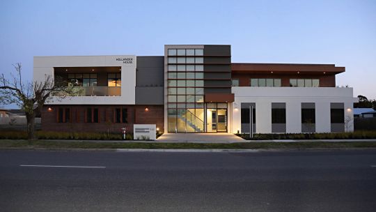
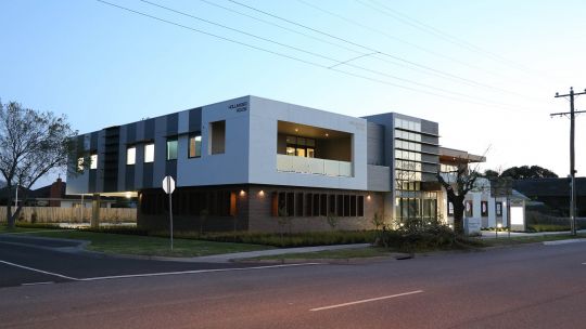
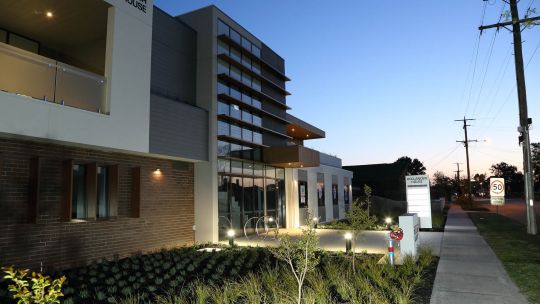
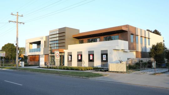
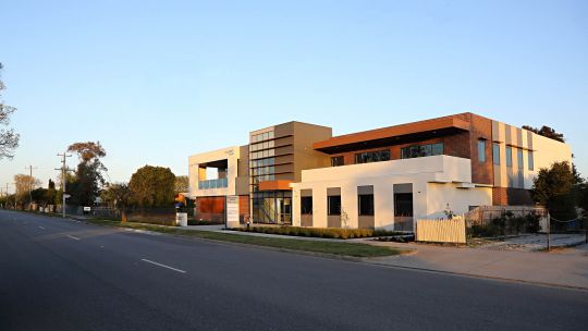
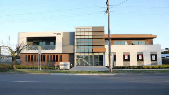
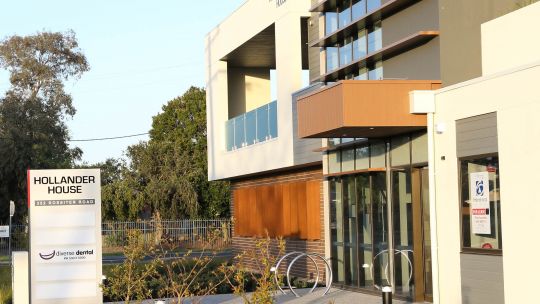
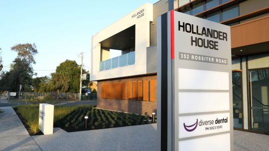
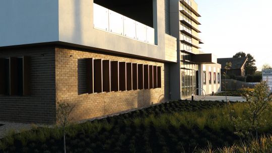
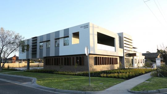
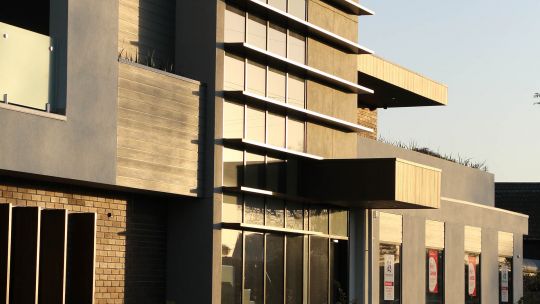
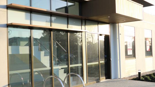
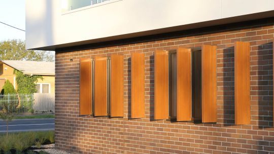
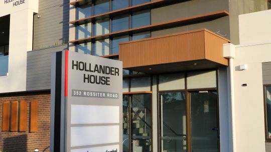
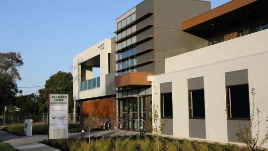
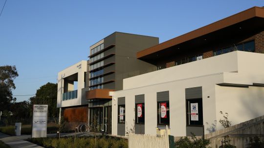
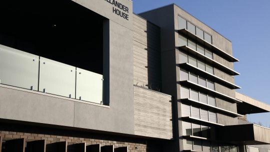
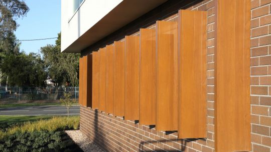
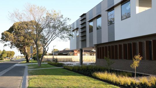
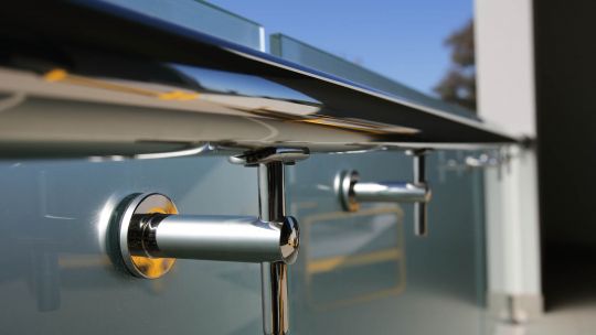
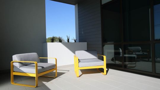
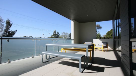
From the front, the building presents a contemporary facade, with alternating red brick and rendered cement walls set at subtly different levels, bisected by a glazed stairwell. Timber panels and fins on the windows and across the stairwell help to soften the brick and concrete aspects which enhances the building with a natural, welcoming feel. The building contains two balcony areas to the front elevations, each with a unique architectural treatment providing spaces to enjoy the open air in comfort.
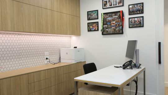
From the side, the clever architecture is revealed with the rear of the building suspended on columns to provide undercover parking. The top floor seems to float in the air, giving an impression of lightness while vertical panels of alternating greys tie the side of the building into the streetscape. For the practice itself, Naomi wanted a warm and welcoming feel with natural textures augmented by carefully considered colour. The practice was to contain four chairs in generous treatment rooms with the usual dental utility rooms including lab, sterilisation, OPG, offices and a staff room.
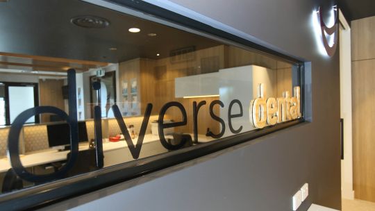
The beauty of a purpose designed building meant that all these areas were easily accommodated within the design. From the moment you step inside Diverse Dental, you know you are in a special place. The feeling you get when everything just "works" from a design perspective is a subtle but potent reminder that this is a place that has been carefully created by people at the top of their field.
The practice and indeed the building itself have been designed and constructed in complete compliance with all statutory requirements for energy efficiency and disability access without compromising the aesthetics. Nothing feels forced, rather it all works as part of a cohesive whole.
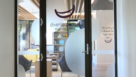
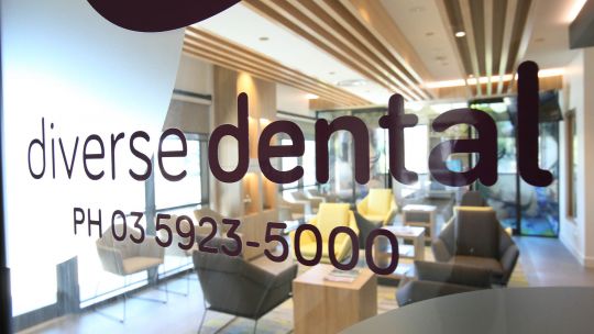
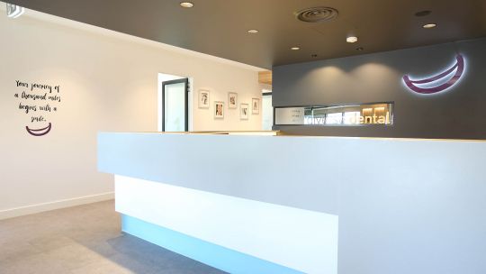
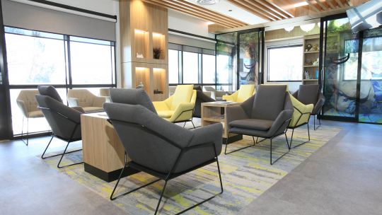
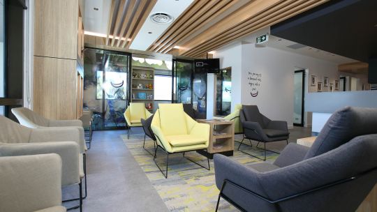
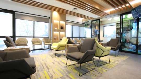
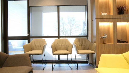
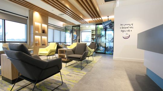
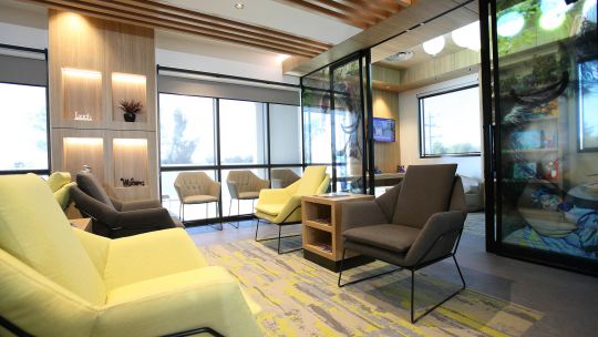
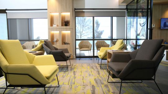
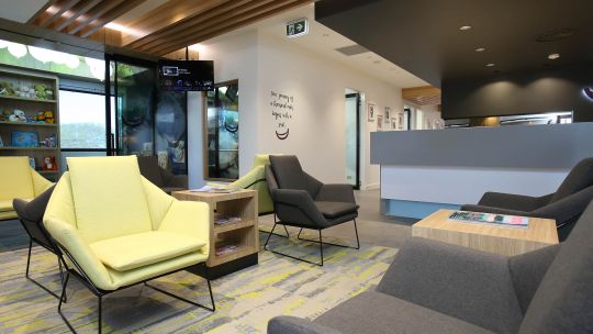
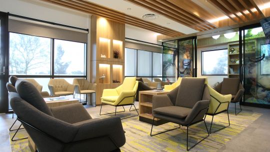
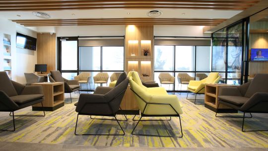
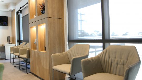
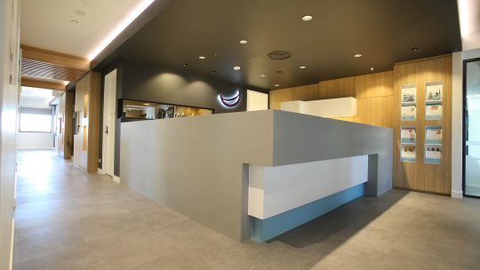
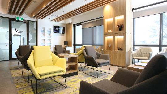
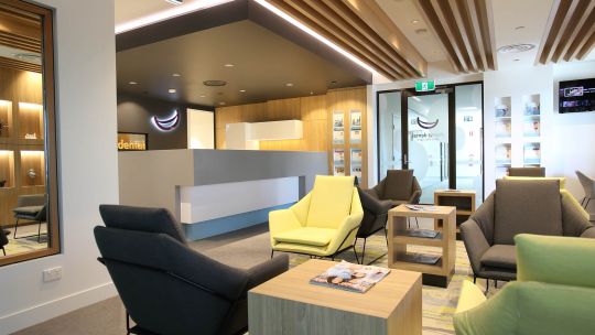
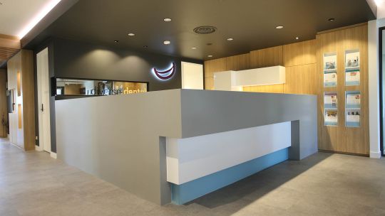
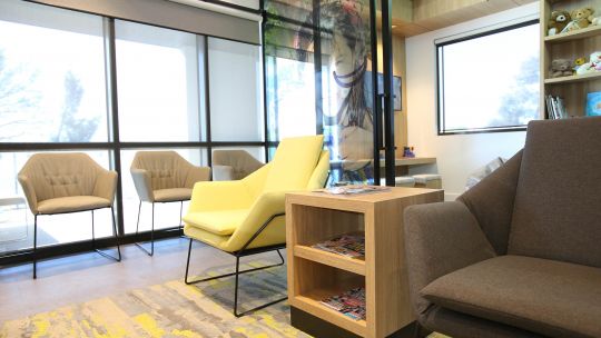
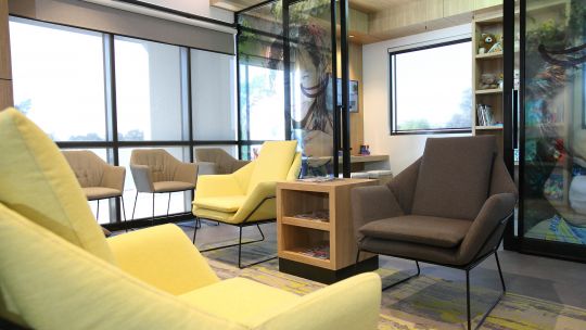
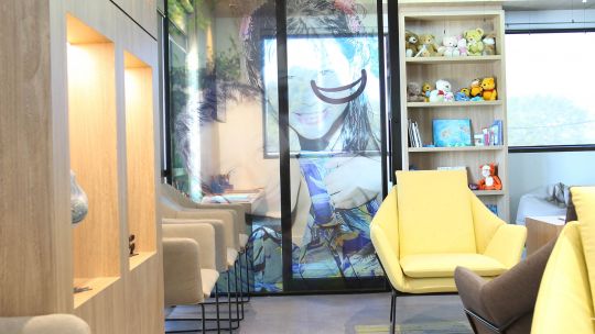
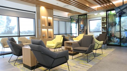
Upon entering the practice, an inviting and spacious reception and waiting room greets you. White walls with light timber joinery and ceiling fins throughout are accented with natural greens and soft greys in the loose furniture and carpet detail. The combination of neutral tones with hints of green evoke a sense of nature indoors. The greys are carried through in the reception counter and the walls and ceilings in the reception area providing an easy visual cue for new arrivals.
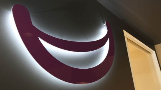
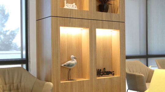
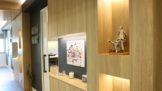
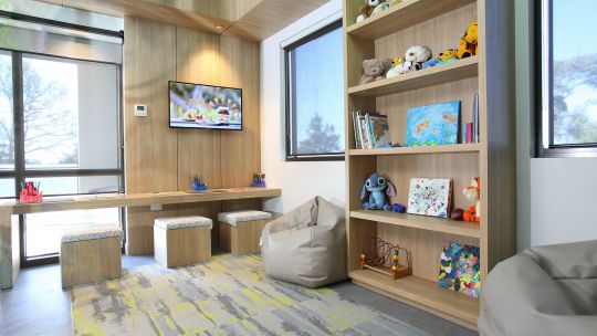
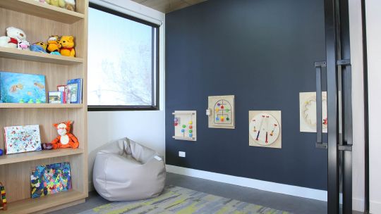
The practice logo, a huge smile is positioned behind the reception counter to welcome patients and reinforce the idea that this is a happy place. A children's play area complete with activity stations, toys and screen is located adjacent to the main waiting room, accessible behind transparent screen doors so that young children can be seen and not necessarily heard. Light timber display cases and occasional tables echo the textures in the ceiling fins and lend the waiting area a sophisticated but approachable feel. Recesses have been built in to the columns to provide attractive storage for brochures and patient information sheets.
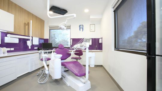
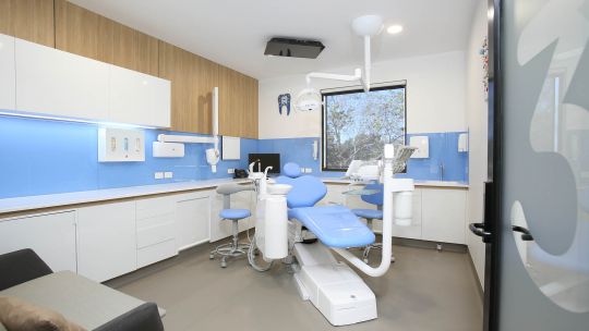
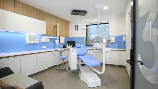
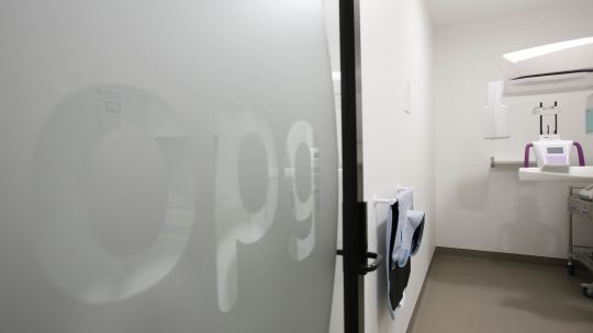
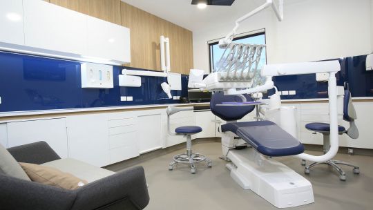
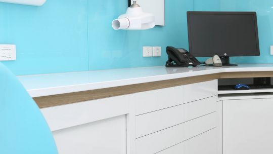
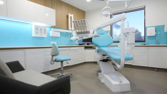
A central corridor links the treatment rooms, sterilisation room and offices, each area identified with subtle signage built into the frosting on the glazed doors. The four large treatment rooms have their own signature colour, carried through to the chairs leather finish and splashbacks. In each treatment room, soft pastel grey floor coverings, glacier white cabinetry and carefully positioned timber wall panels work in harmony with the signature colour to create four distinct, yet congruent surgery environments. Ceiling mounted screens offer a pleasant distraction for patients undergoing treatment. An OPG is situated between surgeries 2 and 3
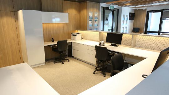
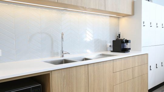
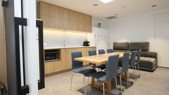
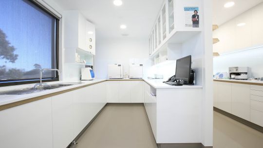
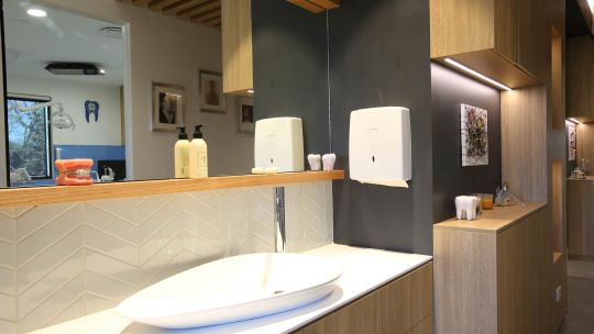
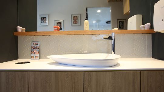
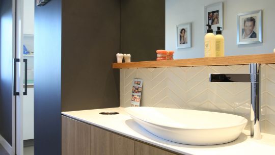
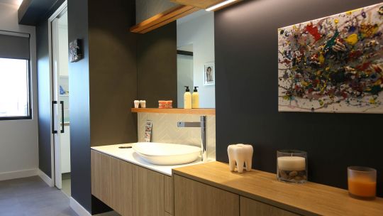
The sterilisation room and lab are located at the rear of the practice and finished in glacier white with Corian benchtops for the ultimate in durability and practicality. Ample storage is provided by the bespoke under bench and overhead cabinetry. The bespoke Medifit cabinetry includes specialised equipment trays and soft touch drawers, allowing for easy access to equipment and supplies when needed. An elegant patient refresh area adorned with a beautiful pear-shaped basin and herringbone tiles gives patients a chance to freshen up post treatment. A comfortable staff room and office is found in the area behind reception with walk through access to a staff only corridor culminating in the acoustically insulated plant room.
Sam Koranis said,
“the overall effect is stunning. A contemporary practice with an ageless style and the perfect environment for Dr Hollander to pursue her dental and business ambitions”. We appreciate the trust that Naomi put in us for the second time. When a project of this scale is undertaken there needs to be a strong level of trust by the client in their selected team.
The practice opened for business on time and was booked solid in the first week. From the time Medifit started on site it only took 9 months to build & complete the fitout in its entirety.
Dr Hollander adds
"I just want to say a BIG thank you to everyone at Medifit for the amazing project you have completed at Koo Wee Rup. I think the outcome is outstanding! Sam, I really appreciate your openness, mentorship and honesty. You say it how it is, and I love that. Further to this I wish to add that the project not only came in under budget (which is no mean feat for a project of this scale) & was completed on schedule” “Medifit proved that being the longest serving national company in the healthcare design & construction arena equates to a great outcome at every level. I would highly recommended Medifit for any project on any scale as proof is in the pudding. Once again Thank you to all the team”
