Seven years after graduating from Adelaide University, Dr Christopher Patel decided to look for a place in the sun to call his own and is now the proud owner of a brand new practice in Queensland.
“I’ve worked in four private practices since graduating and have drawn many ideas from each experience,” Dr Patel said. “So when it came time to set-up a practice of my own, I had a good idea about what I wanted.
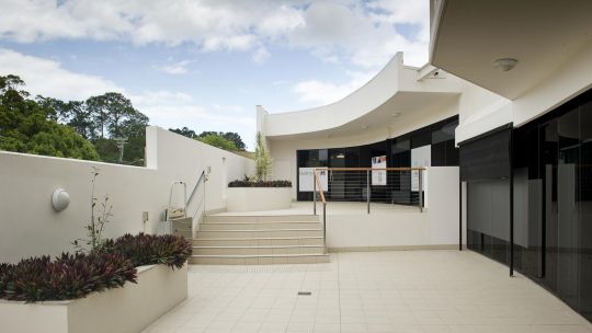
“My partner, Kacey and I then searched for 6 months for a practice site which fulfilled our space requirements, zoning and the practice which we wanted to create. We finally found a 92 square metre tenancy located on the ground floor of the sleek and modern Ballinger Place in the heart of Buderim on the Sunshine Coast and purchased the tenancy subject to council approval for a dental practice.
“Over the years of reading Australasian Dental Practice, I’ve noticed a steady growth in dental design and fit-out companies and could see the value in using a specialist in this field. I then spoke with a colleague who had just finished a ground up build in South Australia about his experiences with Medifit.
“It was clear by the end of this, that Medifit had met his expectations and they had finished the project on time and on budget. I then made contact with Medifit and spoke with Sam Koranis. We met Sam at the site and we were immediately impressed with his analysis, which obviously only comes from having extensive experience in dental practice design and fit out. He spoke at length about the advantages but also the limitations of the site. We appreciated his honesty. Within a few days, Sam had emailed a design quote, construction forecast and time frame for the design and fit out of the site.
“After discussing the approximate forecast with our accountant, we signed the agreement and it was full steam ahead. We gave Medifit a 4 month deadline to design, acquire council and body corporate approval and fit out the premises to begin trading.
The initial phase was for Kacey and I to write down in detail the type of practice we wanted reflecting our dental values and the range of treatment options we wanted to provide our patients. We then discussed these at length with Medifits’ designer. In conjunction with the site survey, OH&S and state regulations, Medifit sent a preliminary drawing. After a few minor changes and suggestions, the second draft was sent through and approved by us. Medifit then produced the concept design stage inclusive of 3D models and colour boards, which gave us total clarity on what we were going to receive. The accu- racy of these 3D images was amazing and emulates the final result.
“Most of our communications with Medifit was conducted via email, which allowed us to work on the project after clinic hours. As Medifit is based in Perth, this worked to our advantage in that the emails were answered on the day due to the time difference. We were again impressed that the drawings provided by Medifit reflected the vision we had dreamt. The next task was to provide a detailed list of every clinical and non-clinical apparatus we use. This seemed a daunting task, which was made easier by the spreadsheet provided by Medifit. This was an extremely important aspect of the whole design as each apparatus used denoted how many and where the power points needed to be placed, right down to the brand and size of fridge! Altogether the design stage was completed in 5 weeks, which to my surprise, was reasonably quick. I think this was achieved by having a designer that shared the same vision and understood what we wanted to create.”
Medifit’s general design philosophy for the project was to create a modern, relaxed feel for the new practice that was a reflection of the Sunshine Coast location and to fully utilise the ample natural light available to the premises.
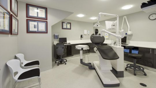
The brief called for two operatories, a steri/lab area, practice manager’s office, staff room, reception and waiting area. Rest rooms were already located within the building complex external to the practice.
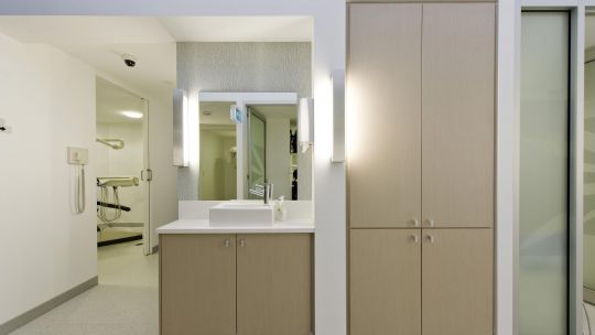
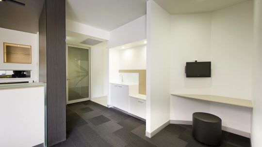
The overall finishes and colour palette is a mix of whites, greys, light timber and a subtle blue accent colour uses sparingly to pick up the colour in the glass that is prevalent throughout the interior.
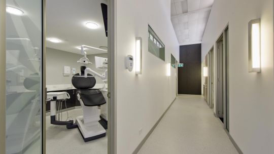
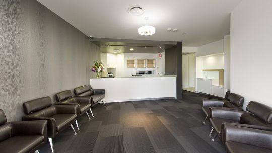
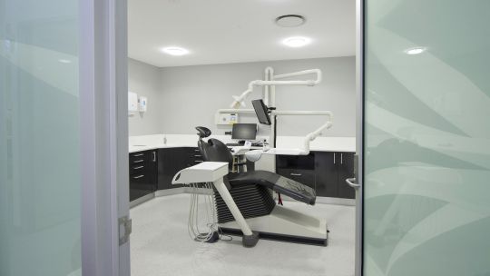
The layout itself was designed around maximising the glass frontage and it therefore made sense that the reception and waiting areas be orientated along the length of the practice as mush as possible and have both surgery’s coming off a corridor which also runs the length of the practice. This in effect allowed maximum natural light to enter the practice and provided a vista for both staff and clients which is also facilitated through the use of glass partitioning to the operatories.
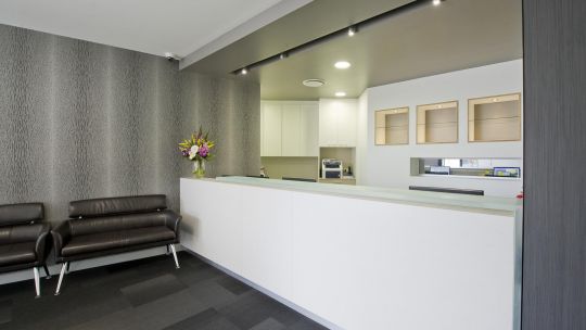
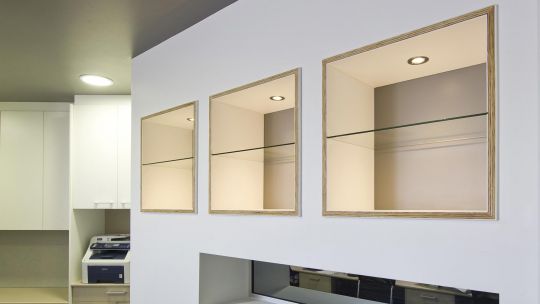
The reception area is simple but sleek. The counter is lineal in design and terminates with a vertical blade wall veneered in a striated ceramic cladding that provides a visual contrast to the lighter colour palette that is used throughout. As well as being a visual feature, it also creates privacy for the receptionist. A painted bulkhead above the reception area also helps to delineate the this area and provide visual interest upon entering the practice.
An angled feature wall opposes the clad wall which contains the magazine display and houses a TV. This forms a simple design to eliminate clutter and provide a focal point for clients whilst they wait. The angled wall leads the eye down the corridor which is lined on one side with floor to ceiling storage space that is finished in a warm, light timber laminate and creates visual continuity along the length of the corridor.
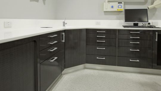
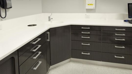
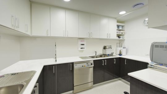
The operatories running off the front corridor are finished in a contrast of white Corian bench tops, dark timber laminate cupboards and neutral painted walls which is a colour theme that is repeated in the steri/lab area. The dental units are angled towards the windows so both client and staff can enjoy the view.
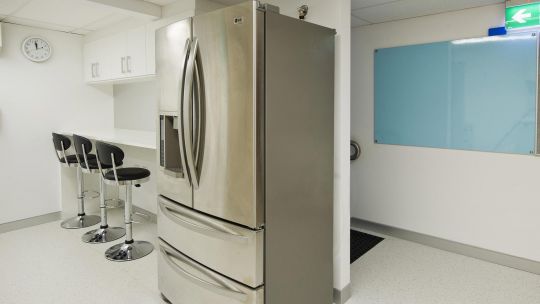
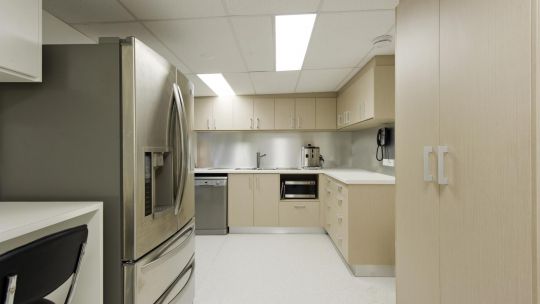
A small staff area is located to the rear of the tenancy and includes a kitchenette, staff lockers and a bar style bench and seating.
“Within 3 weeks of starting the project, the practice was taking shape and progressing on schedule,” Dr Patel said. “We had weekly on-site meetings with the construction manager, Claus Heine, to discuss the progress and any concerns. In all, the tradesmen were friendly, accommodating and professional.
“The project was completed on time in early August 2009. The equipment was then installed over the next week, in conjunction with the resolution of a few minor defects.
Having been to see a colleague’s new practice completed by a builder without dental experience, it is easy to see the difference in finish standards and ease of equipment installation and functional design.
“We held a grand opening soon after where we introduced the practice to local businesses in the area. People were impressed with the fit-out, colour scheme and overall feel of the practice. We are now into our eighth week of practicing and have been very well received by our patients. I am now looking forward to working with Sam and his team at Medifit on our satellite practice. I have no hesitation in recommending Medifit to any dentist who is ready to create and realize their vision!”
